
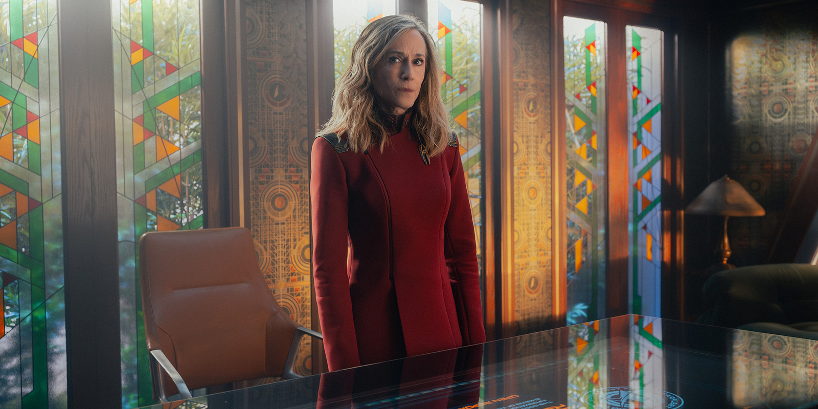
BOLDLY GOING WHERE I’D NEVER GONE BEFORE
Tommy Maddox-Upshaw ASC reflects on honouring Star Trek’s legacy while crafting a warmer, intimate visual language that balances anamorphic tradition with modern in-camera innovation.
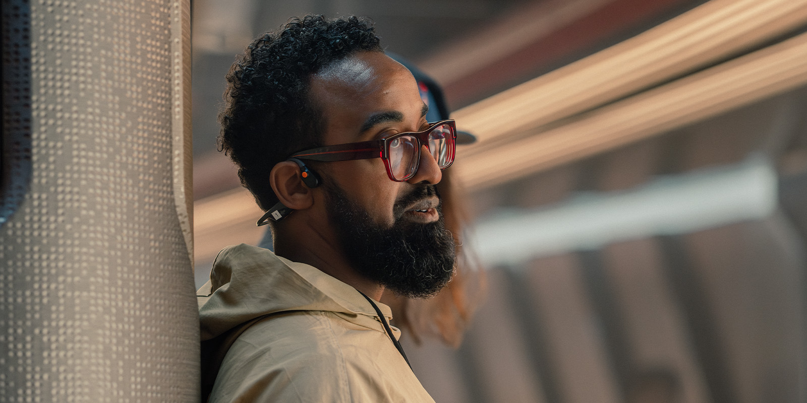
I grew up on Star Trek original films and series marathons, in the glow of Steven Spielberg movies, balanced by darker fare like Alien.
As a kid in Boston, watching Captain Kirk command a bridge that looked like the world I wanted to live in meant something profound. It wasn’t just escapism — it was aspiration. Trek was hopeful without being naïve, philosophical without losing its humour. That emotional clarity stayed with me long after the reruns ended.
When Alex Kurtzman invited me to help define the look ofa new chapter, Star Trek: Starfleet Academy, I wanted to protect that emotional core — and evolve it somewhat.
From the start, we talked about “messy Trek” and leaned heavily into shorter focal lengths on large-format sensors — 50mm and 65mm equivalents.
We shot on Sony Venice 2 cameras 8.6K 3:2, for their beautiful colour science and neutral flesh tones, paired with custom Panavision 1.3x anamorphics (Ultra Panatar 2s/C/E variants, recipe’d by Dan Sasaki, vice-president of optical engineering at Panavision,). These gave us classic anamorphic character — messy flares with organic bokeh — while staying close focus spherical sharpness in 1.78:1. No heavy edge distortion; we could rack focus on foreground and background faces without “footballing”. Lighting was a deliberate mix: LEDs (Vortexes, Aputure Infinity bars and Aputure X150 units) for flexibility, tungsten (20K Mole Beams) for hard, sharp flares, custom T-Pars for backlights. Each source reacts differently with the lenses, creating variety and “controlled mess”.
The camera became our foundation. I’ve always admired its colour science, particularly the way it renders diverse skin tones with neutrality and flexibility. But camera choice was only half the philosophy. The larger question was anamorphic language. Classic 2x anamorphics carry history — beautiful, yes, but sometimes too distorted for the intimacy we wanted in a 1.78:1 frame. I tested extensively: 2x, 1.5x, multiple vendors. They were stunning, but they didn’t quite articulate the hybrid language Alex and I envisioned.
Panavision’s Ultra Panatar 2 1.3x anamorphics became the bridge. They offered subtle oval bokeh and controlled flares, yet allowed us to get physically close to the sensor plane — sometimes nine to 12 inches — without excessive distortion. That proximity changed everything. It meant we could sit inside a performance, feel breath and hesitation, while still retaining anamorphic dimensionality.
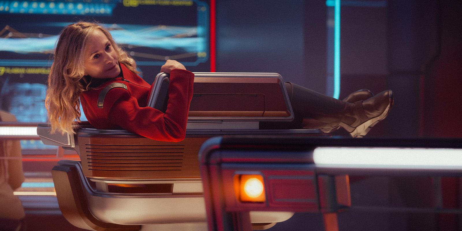
Lighting became a dialogue between eras. I mixed modern LED systems with tungsten sources — not out of nostalgia, but because they behave differently. I used T-Par 10K tungsten lights made by Phil Walker. Tungsten gives you hard, honest flares and rich spectral texture, which I combined with small LED puck lights. LEDs, I feel, offer precision and control. Together, they create unpredictability. Life isn’t lit by one type of source; why should a starship be? Two sequences crystalised this philosophy.
The opening of episode one (“Kids These Days”) centres on a young boy (Solen Morales as Caleb) staring out of a window beside his mother (Tatiana Maslany as Anisha). Outside was a matte painting, intentionally restrained with a deep T-stop, yet still showing fine detail. That limitation became our opportunity. I had to sculpt interior light carefully: enough information to sell depth, but enough restraint so VFX could extend atmosphere and moons later. Over-light, and the composite breaks. Under-light, and wonder disappears.
Practically speaking
Working alongside VFX supervisor Jason Zimmerman, we kept asking: what does the story need and what can we leave unsaid? I allowed practical light to define the boy’s curiosity — a gentle edge wrapping his profile, a soft ambient glow carrying hope. The matte painting would provide scale; my job was to provide emotion. It was a dance between absence and presence.
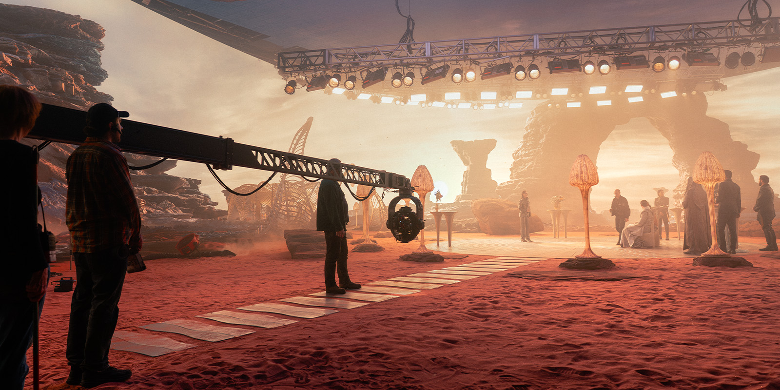
Then there’s the approach to Earth in the atrium. What appears to be a massive exterior vista is actually a playback video wall. Those environments are unforgiving. Exposure becomes surgical. If the wall is too bright, highlight details in the wall wash out. Too dim, and the illusion collapses.
We tested relentlessly to find the balance where the wall felt like sunlight pouring through glass while skin tones remained natural and dimensional. I used subtle backlights to separate figures from the environment, letting the anamorphic lenses catch gentle flares — not aggressive streaks, but whispers of light. When we later blend to a full exterior, the transition feels invisible because the emotional exposure is already correct in-camera.
We embraced imperfection — slight mixed colour temperatures, a practical flicker, gentle falloff at the edge of frame. Those nuances prevent the future from feeling antiseptic. On set, we’d build structured shot lists but allowed evolution. The adults work on the bridge for most of the show, so we’d shoot them on longer lenses with less handheld.
Ultimately, pairing the Venice 2 with the 1.3x anamorphics wasn’t about specs. It was about ideology. Tradition and progression coexisting in the same frame. Respecting where Trek evolved to while allowing it to move on to a new modern cinematic language.
When I watch the boy at the window, or the crew gazing at Earth, I see more than technical achievement. I see intention. Those moments carry the warmth I felt as a kid watching reruns — that belief that space isn’t empty, it’s possibility.